
Global Warming and Hurricanes Figures
Figure 1
Two different statistical models of Atlantic hurricane activity vs sea surface temperature (SST). The upper panel statistically models hurricane activity based on “local” tropical Atlantic SST, while the bottom panel statistically models hurricane activity based on tropical Atlantic SST relative to SST averaged over the remainder of the tropics.Both comparisons with historical data and future projections using this approach are shown. See Vecchi et al. 2008 for details.
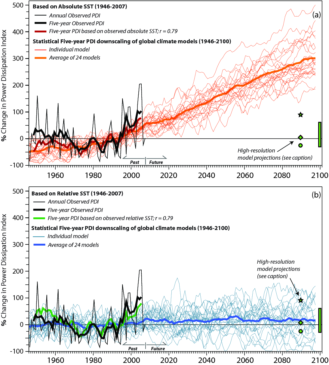
Figure 2
Reconstruction of Atlantic tropical storms (1878 to current) with adjustments during the pre-satellite era (1878-1965) based on weather reporting ship track density in the Atlantic. Blue curve shows the adjustment for estimated number of missing storms. From Vecchi and Knutson (2008)
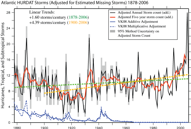
Figure 3
Reconstruction of Atlantic tropical storms (1878 to current) with adjustments during the pre-satellite era (1878-1965) based on weather reporting ship track density in the Atlantic. Blue curve shows the adjustment for estimated number of missing storms. Source: CCSP 3.3 (2008), Figure 2.17, page 60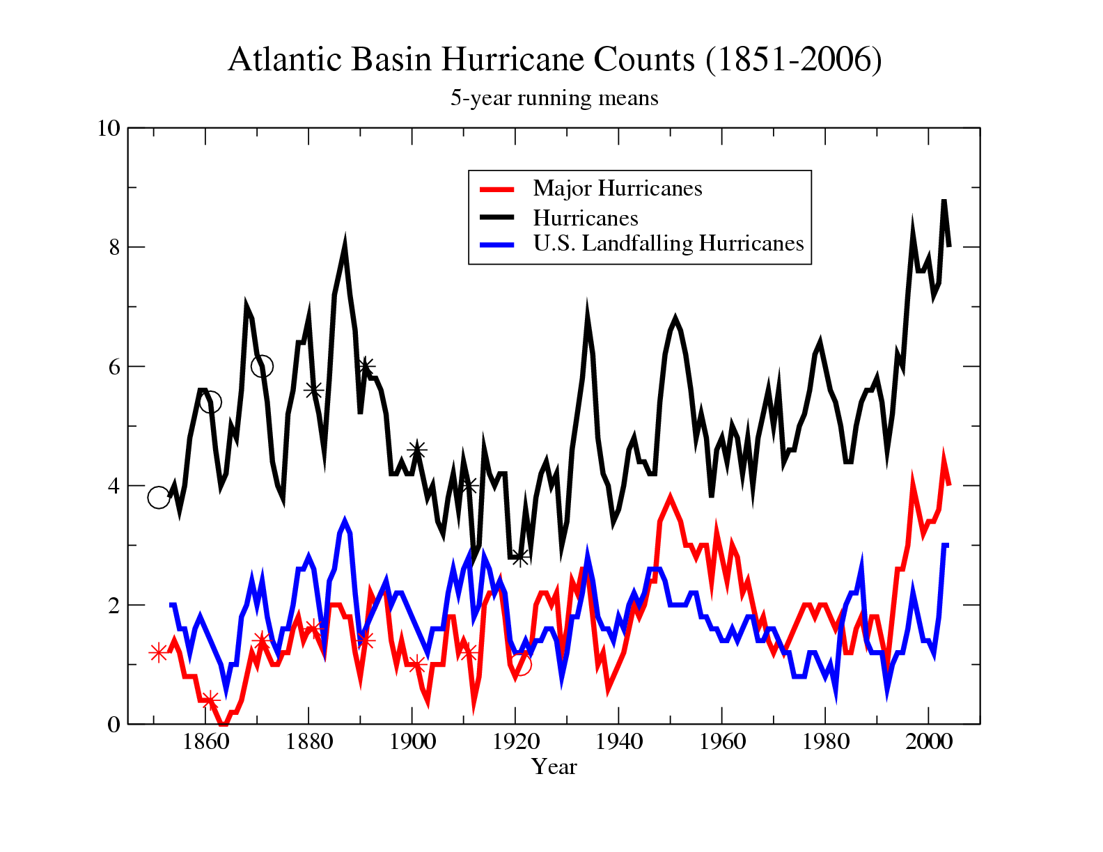
Figure 4
Five-year running means of tropical Atlantic indices. Green curves depict global annual-mean temperature anomalies (top) and August-October Main Development Region (MDR) SST anomalies (second from top). Blue curve shows unadjusted Atlantic hurricane counts. Red curve shows adjusted Atlantic hurricane counts that include an estimate of “missed” hurricanes in the pre-satellite era. Orange curve depicts annual U.S. landfalling hurricane counts. Bottom green curve depicts August-October anomaly of MDR SST minus tropical mean SST. Vertical axis tic marks denote one standard deviation intervals (shown by the ? symbol). Dashed lines show linear trends. Only the top three curves have statistically significant trends. Source: Journal of Climate, vol. 24, 1736-1746 (2011).
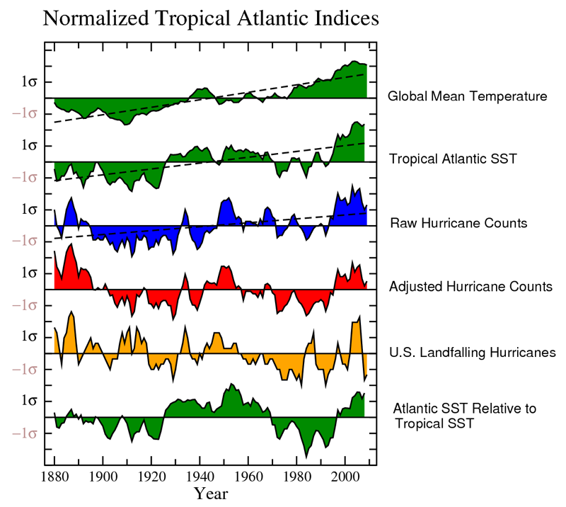
Figure 5
Simulated vs. observed Atlantic hurricane counts (Aug.-Oct) for 1980-2012 using the regional downscaling model of Knutson et al. (2008)
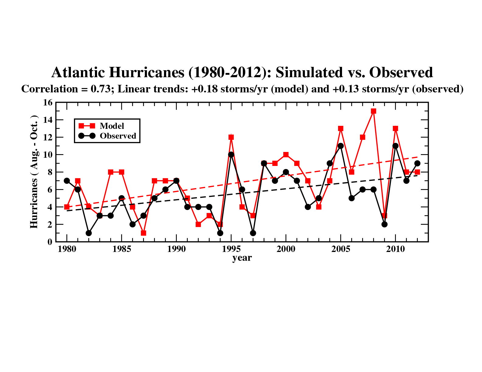
Figure 6
Left: Distributions of wind speeds for Atlantic tropical storms and hurricanes (August-October). Black curve shows observed distribution, blue curve the simulated distribution for present day climate, and red curve the simulated distribution for the late 21st century (IPCC A1B forcing scenario). The strongest observed hurricane intensities are not reproduced by the model, and there is a strong reduction in the number of storms in the warm climate experiments, compared to the control (present day). There is an increase in the number of the very strongest simulated storms in the warm climate, relative to the control. Right: The normalized histogram (right) was obtained by dividing the values from each curve on the left by the total number of storms observed or simulated during the 27 yr period. This controls for differences in storm frequency between the control and warming experiments or between the control and observations. The storms that do occur in the warmer climate simulation are more intense on average than those in the control (present day) simulation. From Knutson et al. (2008)
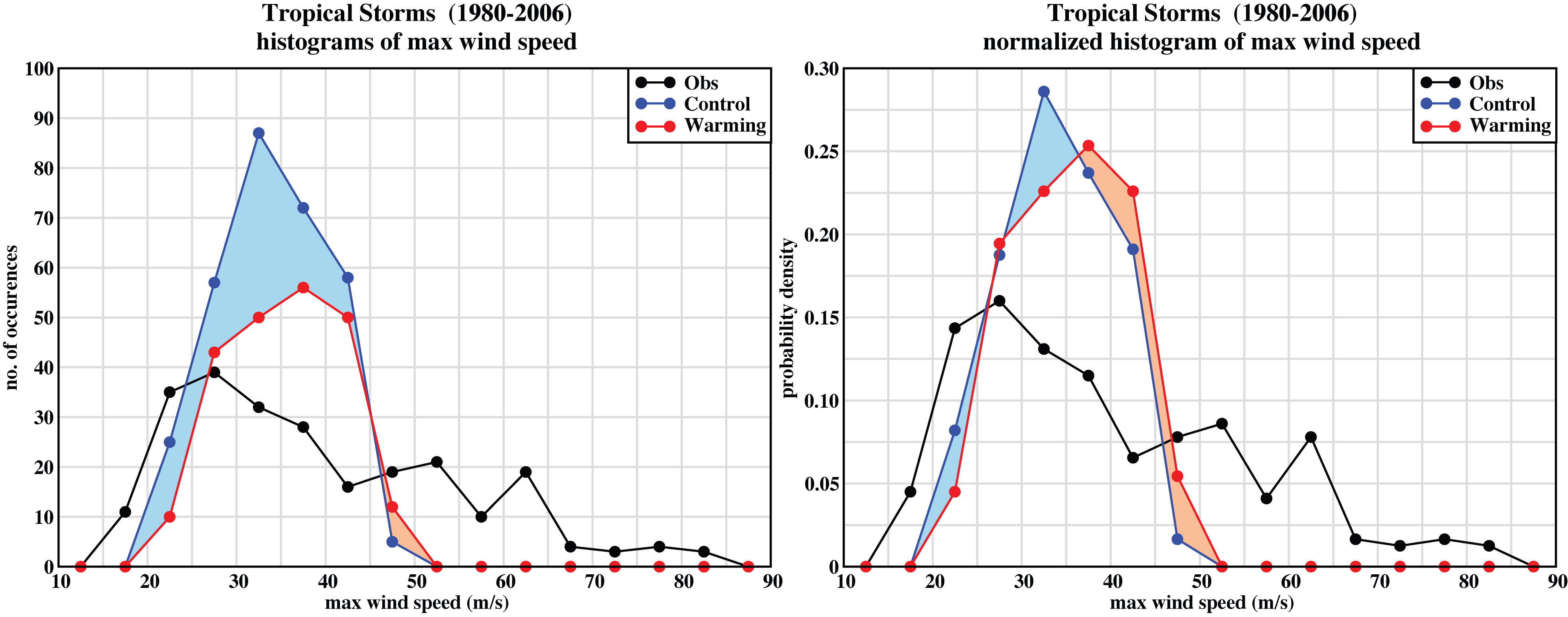
Figure 7
Tracks of simulated Atlantic Category 4 and 5 hurricanes for the present climate and for a warmer climate condition projected for the late 21st century. The hurricanes were simulated using higher resolution atmospheric models, with large-scale conditions taken from an ensemble of 18 global climate models. Source: Bender et al. 2010.
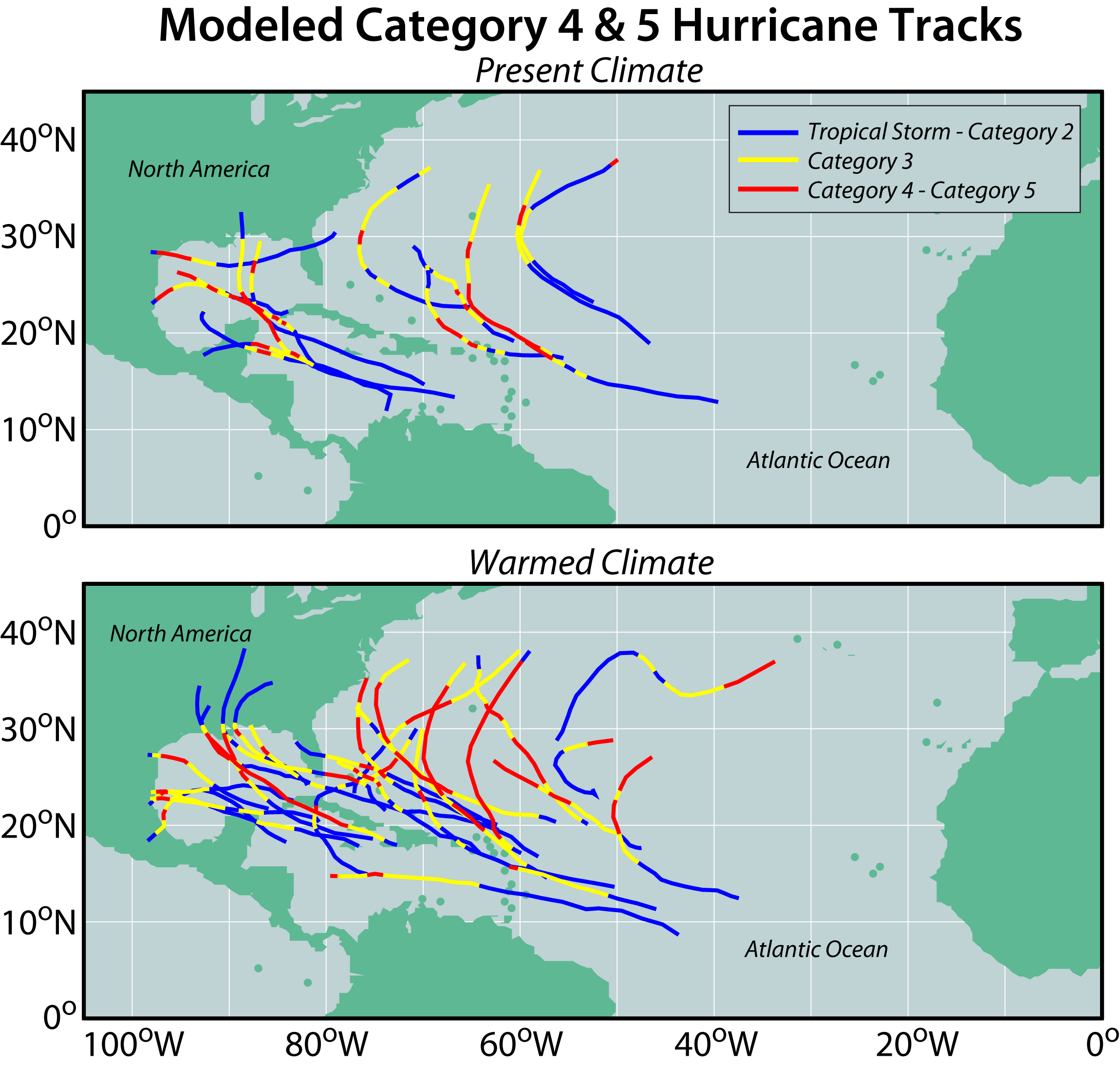
Figure 8
Simulated occurrence of all tropical storms for (top) present-day; (middle) late 21st century, RCP4.5 CMIP5 multimodel ensemble; or (bottom) difference: late 21st century minus present-day conditions. Simulations used the GFDL hurricane model to re-simulate (at higher resolution, with grid spacing as fine as 6 km) tropical cyclones occurring in a global atmospheric model simulation (50 km grid spacing model). Occurrence is defined as the number of days when a tropical cyclone with surface winds exceeding gale force (17.5 m/sec) was found within each grid box during a 20-year simulation period. Source: Knutson et al. 2015
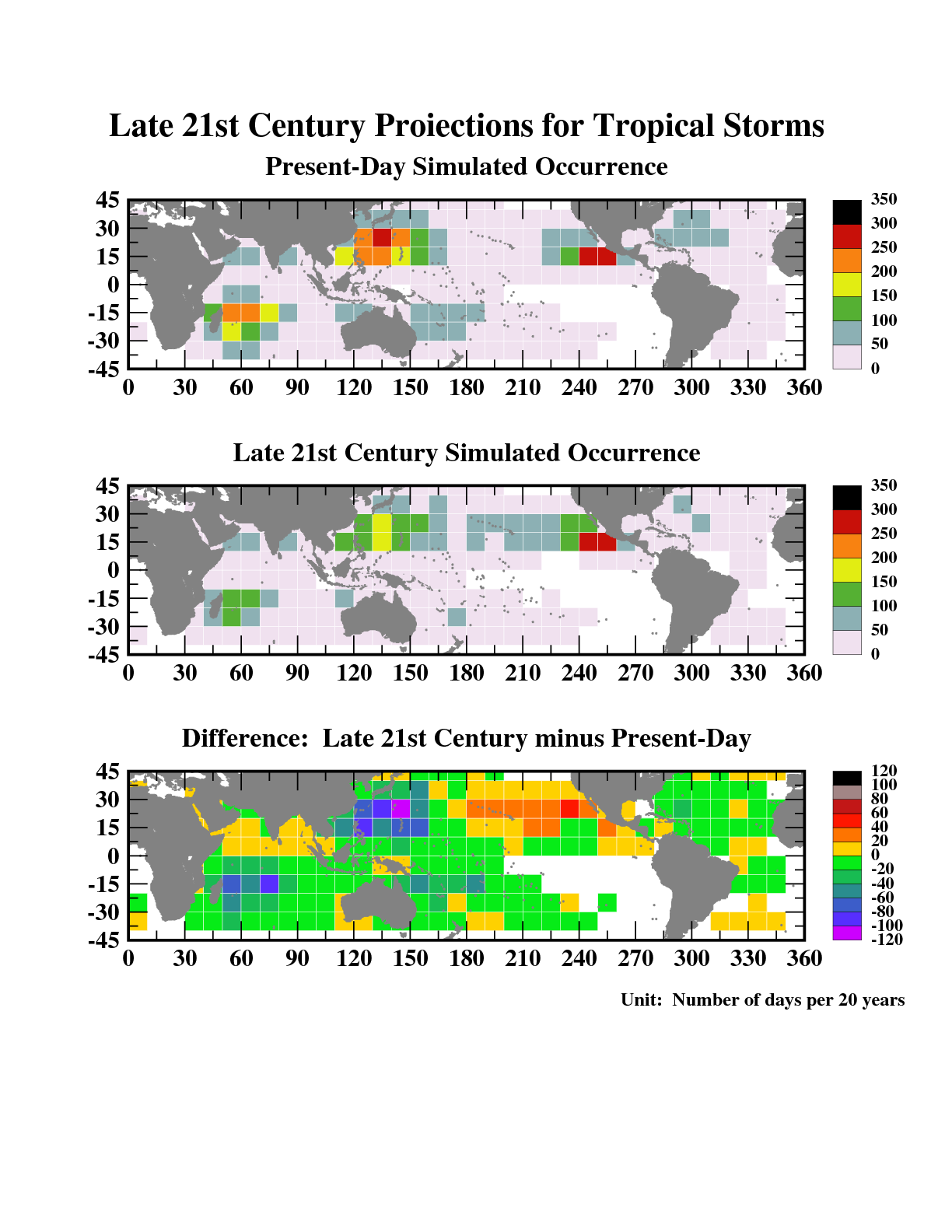
Figure 9
Tracks of simulated very intense tropical cyclones (Saffir-Simpson category 4 or 5) for: (top) present-day; or (bottom) late 21st century, RCP4.5 CMIP5 multimodel ensemble. Simulations used the GFDL hurricane model to re-simulate (at higher resolution, with grid spacing as fine as 6 km) tropical cyclones occurring in a global atmospheric model simulation (50 km grid-spacing model). Storm intensities are shown over the lifetime of each storm, according to the Saffir-Simpson scale. The categories are depicted by the track colors, varying from tropical storm (blue) to category 5 (black). Each tropical cyclone shown had simulated surface winds exceeding 59 m/sec (131 miles/hour) at some point during its lifetime. Source: Knutson et al. 2015
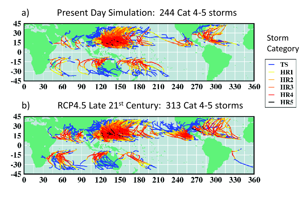
Figure 10
Precipitation rate profiles as a function of radius from the center of the composite tropical cyclone. These were constructed as an average for the 10% rainiest storms in our present-day (blue curve) and late 21st century (CMIP5, RCP4.5 scenario changes; red curve) tropical cyclone simulations. See Figure 8 caption for more details. The curves show that tropical cyclones in a warmer climate have higher simulated precipitation rates. Source: Knutson et al. 2015
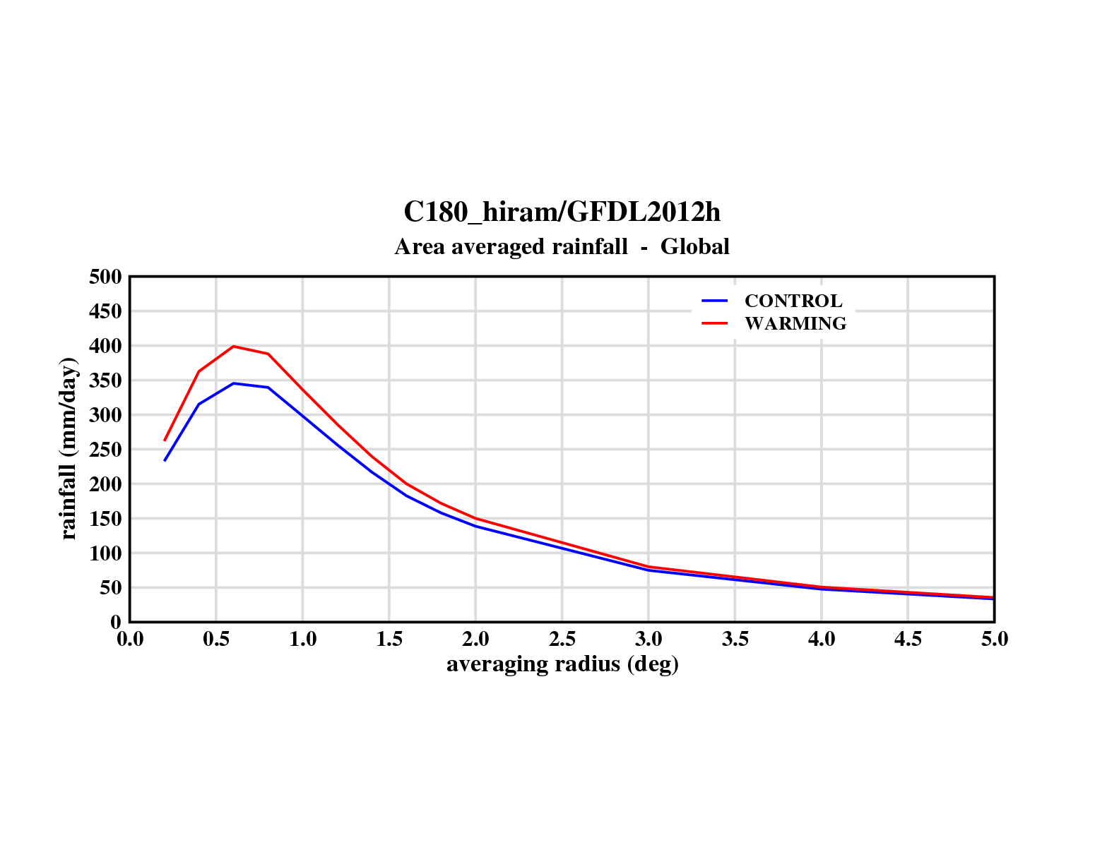
Figure 11
Comparison of simulated hurricane intensities for present-day (thin line) and future (thick line) climate conditions assuming an 80-year build-up of atmospheric CO2 at 1%/yr compounded. The results are aggregated from sets of experiments using nine different global climate model projections and four different versions of a high-resolution hurricane prediction model.
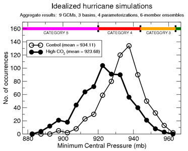
Figure 12
Top: a tropical storm as simulated in a global climate model. Shown are surface temperature (shading), pressure and winds. Bottom: the same storm case, but as simulated with the hurricane prediction model. Shown are surface winds and precipitation on the inner grid of the hurricane model. The vector spacing illustrates the resolution of the two models (250 km for the global model vs. 18 km for the hurricane model.)
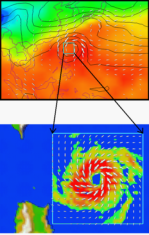
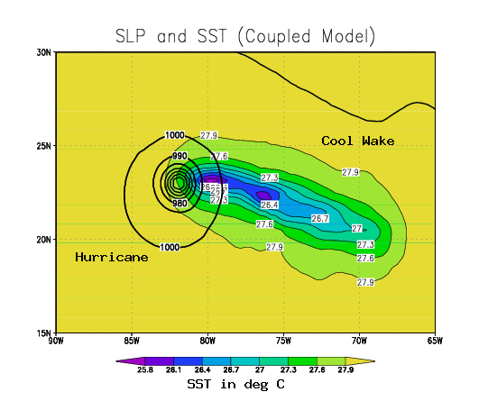
Figure 13
Sea surface temperatures (SSTs, light contours and color shading, in degrees Celsius) and sea level pressure (dark contours, in millibars) from an idealized coupled hurricane model/ocean model experiment. The “cool wake” in SSTs produced by the hurricane is indicated by the lower SSTs to the east-southeast of the storm. The storm motion is toward the west-northwest.