
Is precipitation changing in your region due to human-caused climate change?
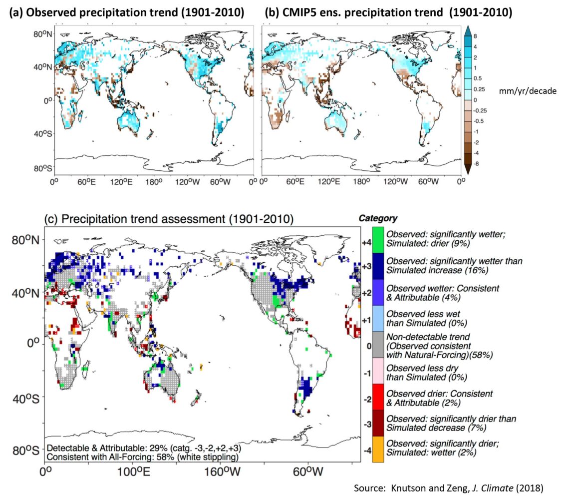
In our precipitation trends analysis (Knutson and Zeng, Journal of Climate, 2018), we looked at historical observed and modeled annual-average precipitation trends over the period 1901-2010. Our analysis can be used as an initial indicator of whether there is detectable anthropogenic (human-caused) climate change affecting annual-mean or seasonal-mean precipitation over various land regions. To see what our analysis indicates for your region of interest, locate your general region in the three panels below. The medium and dark blue patches on panel (c) below (category +2 or +3) show where we infer a detectable anthropogenic increase in annual precipitation, for example. [A useful NOAA/NCEI interactive site for viewing historical time series of precipitation, temperature, and other variables for individual U.S. states is here.]
Annotated Map
Detailed description. In the figure above, panel (a) shows the observed annual-mean precipitation trend (1901-2010) in mm/yr/decade, with blue colors showing increases and brown colors indicating decreases; panel (b) shows the average trend from historical climate simulations of 10 CMIP5 models; and panel (c) gives our summary assessment–essentially a scorecard for possible anthropogenic influence on precipitation.
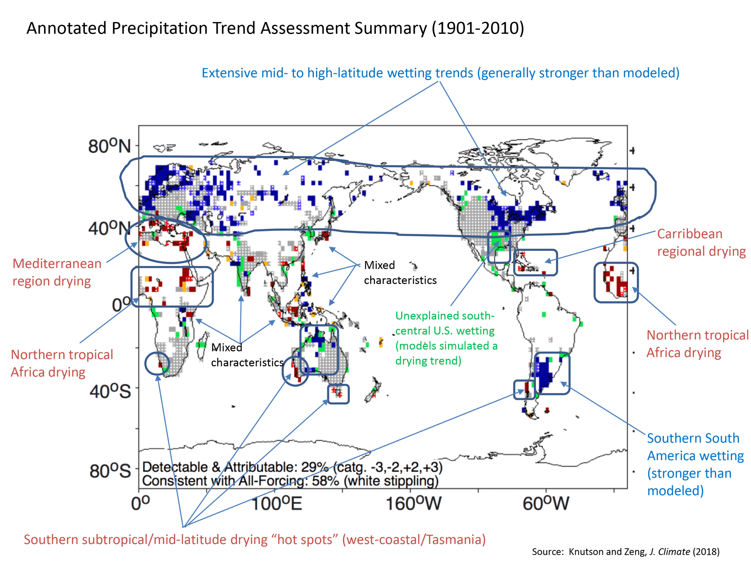
In panel (c), the medium and dark blue patches (category +2 or +3) show where we infer a detectable anthropogenic increase in annual precipitation. The darkest blue color (category +3) indicates the observed signal is significantly stronger than the model (i.e., models struggle to simulate a wetting trend as strong as observed). These detectable anthropogenic wetting regions — covering about 20% of analyzed land regions — are places where one might be more concerned over the possibility of increasing flood risk at least with regard to the annual-mean precipitation climate. This is fairly common over mid- to high-latitude land regions in the northern hemisphere and in southern South America and northern Australia. The most pervasive anthropogenic signal in precipitation we see globally is this broad-scale moistening tendency in mid-to-high latitude continental regions.
Increased risk of drought due to detectable anthropogenic decreases in annual-mean precipitation are indicated by the medium and dark red shaded regions (category -2 or -3 on panel c). These make up only about 10% of analyzed land regions. The most prominent of these are in the region surrounding the Mediterranean Sea and parts of northern tropical Africa. Smaller regions can also be noted in a number of places, including the west coast of continents in the southern hemisphere extratropics (southwest Africa, southwest Australia and Tasmania, and parts of Chile). Other small regions potentially indicating a detectable anthropogenic drying signal include parts of the Caribbean, Japan, eastern China, Indonesia, northeast India, Sri Lanka, and eastern coastal tropical Africa. A general note of caution is that we have more confidence in a signal with a broad scale consistency across a larger region encompassing many grid points as compared to an isolated gridpoint. Also, drought intensities and duration can be exacerbated by climate warming as well as precipitation decreases, although the warming influence on continental drying can be exaggerated by some analysis techniques that post-process climate model data to infer drought risk.
In panel (c) the grey regions (category 0) show where the observed trend cannot be distinguished from natural variability. In other words, there is no detectable signal in those regions, either because the anthropogenic signal is too weak or the natural variability is too strong for detection of an anthropogenic signal. This is relatively common, being the case over about 58% of the global area with enough data for trend analysis. If a region is white in these panels, there is not enough data available for our trend analysis.
Orange or green regions on the map (categories -4 or +4 on panel c, above) show where there is a significant trend in observations, but where the CMIP5 model ensemble mean is unable to simulate even the correct sign of the observed trend. We might refer to these regions as ones with large unexplained precipitation trends. The south central United States, where observations show a long-term wetting but models simulate a historical drying trend in precipitation, is a prominent example of this, although these problematic regions occur elsewhere around the globe as well.
The inconsistency between modeled and observed trends in precipitation is a continuing research problem. Our analysis identified where such consistency problems are particularly acute. Nevertheless the general overall consistency of pattern between modeled and observed trends (say comparing the mid-to-high latitude regions in panels a and b) suggests that models with historical anthropogenic forcing can at least begin to explain some of the large historical increases in precipitation seen in the mid-to-high latitudes since 1901. But the models do seem to have a dry bias in their simulated annual-mean precipitation trends since 1901 as discussed in Knutson and Zeng (2018).
Temperature Changes. Similar plots but for regional temperature trends are shown here for U.S. temperature changes (Fig. 6.6 from the U.S. National Climate Assessment 4, Climate Science Special Report). Global maps of regional temperature trends, including detection and attribution classification, are shown here, adapted from Knutson et al. 2013.
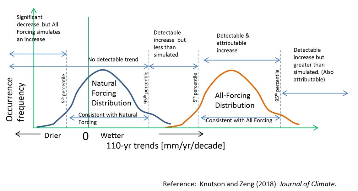
Methodology. The second figure below illustrates a little more about the methodology we used for the above analysis, and how we decided what category to use to classify each observed precipitation trend (grid-box) in panel (c) above. The observed trend is compared with large distributions of trends from models that include simulations of the uncertainty due to internally generated natural variability in the models. We also combined trend information from 10 different CMIP5 models into a single average Natural Forcing or Natural + Anthropogenic Forcing distribution having the characteristics of the average model. More details on the method are contained in our paper (Knutson and Zeng, 2018, Journal of Climate).
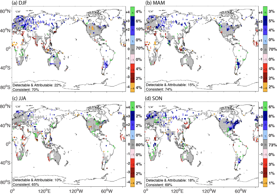
Seasonal-mean analysis. The third figure below is analogous to the annual mean assessment discussed above, but is a summary result for each season (December-February; March-May; June-August; and September-November). We only show the summary assessment panel–or “scorecard”– which assesses whether there is inferred anthropogenic influence on precipitation trends for each three-month season.
The results are similar to the annual mean results, although the strong increases over Europe and eastern North America appear most prominent in northern fall (SON) for northern Europe and eastern North America; for northern winter (DJF) for larger areas of Europe; and for southern summer (DJF) for southern South America. The southeastern US is notable as a region which is assessed as having detectable anthropogenic increases for the fall season but not in the annual mean.
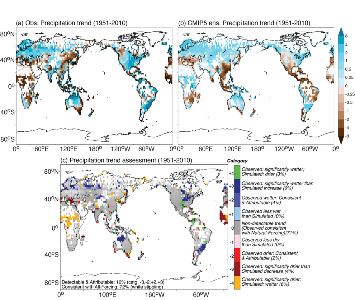
Assessment for 1951-2010 trends. The fourth figure below shows the assessment for the shorter period (1951-2010) which has better spatial coverage than our 1901-2010 assessment at the top of this post. Most of the features in the 1901-2010 analysis are also present for 1951-2010 trends. A difference is over northern tropical and Sahel region of Africa, where the CMIP5 ensemble has the opposite sign of change (wetting) compared to observed trends (drying) over 1951-2010. This indicates the difficulty the CMIP5 ensemble has at simulating low-frequency variability and trends in this region.