

Posted on March 31st, 2015 in Isaac Held's Blog
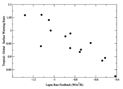 Traditional “lapse rate feedback” in CMIP3 models, over the 21st century in the A1B scenario, plotted against the degree of polar amplification of surface warming in those models (tropical – 30S-30N divided by global mean warming). From Soden and Held 2006.
“Everything should be made as simple as possible, but not simpler.” There is evidently no record of Einstein having actually used these words , and a quote of his that may be the source of this aphorism has a somewhat different resonance to my ear. In any case, I want to argue here that thinking about the global mean temperature in isolation or working with simple globally averaged box models that ignore the spatial structure of the response is very often “too simple”. I am reiterating some points made in earlier posts, especially #5, #7, and #44, but maybe it is useful to gather these together for emphasis.
Consider two regions A and B which together cover the globe. Suppose that we have excellent observations of the mean temperature of A over time and relatively few of B. Let’s also consider the admittedly extreme case with negligible internal variability and CO2 the only external agent causing change. Now assume that some new observations of the evolution of temperatures in B are obtained, resulting in larger trends in B and therefore in the global mean as well. The result is an increase in the estimate of climate sensitivity (transient climate response to be precise) since this quantity is traditionally defined using the global mean temperature. Which is OK, but someone living in A might read of this upward revision of climate sensitivity and mistakenly conclude that the projected response to CO2 in A has increased. Of course, given this setup what the new observations are telling us is that the response to CO2 has a different pattern than what we had thought, not that the response to CO2 is everywhere larger than previously estimated. This scenario is meant to be reminiscent of some of the reaction to the recent work of Cowtan and Way 2014. Putting aside the question of the quantitative implications of that particular study for estimates of the transient climate response, I think this is an example of how the emphasis on the global mean in isolation can be misleading.
Suppose more realistically that there is substantial internal variability, plus other forcing agents, as well as uncertainty in the pattern of the response to CO2 to deal with. Then it is possible that observations in B could modify estimates of the change in A attributable to CO2, depending on how the covariability in A and B intersects with what we know and don’t know about these various factors. The effect on the attributable A response might be positive or negative however.
Or consider the connection between global mean surface temperatures and the Earth’s energy balance. This has become a hot topic, with a number of perspectives on this emerging, some of which I have talked about in previous posts In the simplest box model, perturbations to the global mean energy flux at the top of the atmosphere (TOA) — or what is essentially the same thing on the time scales of interest, perturbations to the heat uptake 


In models, the effective strength of the radiative restoring is stronger for perturbations in tropical temperatures than for perturbations in high latitude temperatures. In addition, temperature responses are less polar amplified in the initial as compared to the final stages of the approach to a new equilibrium with elevated CO2. So equilibrium climate sensitivity is increased beyond what you would expect from fitting heat uptake, forcing, and temperature responses during the initial stage — when the stronger radiative restoring at lower latitudes plays a bigger role. This is sometimes referred to as the difference between “effective climate sensitivity” and equilibrium climate sensitivity. But beyond this distinction in the global mean response, there is the tendency to miss the point that this enhanced climate sensitivity due to the structure of the slow response has larger consequences for polar than for equatorial regions.
Trying to think about these issues while focusing on the global mean in isolation tempts people to think about nonlinearity to explain this behavior, whereas the explanation seems to be primarily that the spatial structure of the linear response is a function of frequency.
As another example, one approach to thinking about the recent hiatus is to focus on the energy balance of the Earth, asking where the energy has gone. But suppose we are looking at some superposition of forced and internal variability (a safe assumption). Both affect the global mean surface temperature and both affect the global mean TOA energy balance (and heat uptake by the oceans), but not necessarily with the same restoring strength 
Additionally, the hiatus is mostly reflecting temperature evolution in northern hemisphere winter, where there has been a cooling trend over the past one or two decades (Cohen et al 2012) The global and annual mean receives so much emphasis that the important constraint this seasonal and spatial structure imposes on explanations for the temperature evolution is often ignored. Take for instance the idea that an increase in heat uptake in the south Atlantic is important for closure of the energy budget in recent years (Chen and Tung 2014). Suppose you could rerun the climate over the past couple of decades and command the South Atlantic not to increase its heat uptake (this is what models are for) — how would surface temperatures respond? I could be wrong, but I suspect that most of the warming would be in the southern hemisphere, with much of the excess heat radiated away in the southern hemisphere as well, with minimal impact on temperatures in northern winter. If this is the way to close the Earth’s energy budget, it does not strike me as plausible that there is a tight connection to the recent hiatus. (I hasten to add that there are other reasons to want to close the Earth’s energy budget.)
As another example, consider the accumulated emission perspective on long-term climate change after emissions cease, in which slow carbon uptake over centuries compensates approximately for the slow equilibration of the climate to the evolving CO2 levels. The southern ocean plays a leading role for both carbon and heat uptake. And from a global perspective these are competing to change the same global mean temperature. But CO2 is well mixed in the atmosphere on time scales longer than a year or two, so any uptake of carbon affects both hemispheres with roughly equal radiative forcing. But uptake of heat in the Southern Oceans affects the southern more strongly than the northern hemisphere. This distinction can get lost when discussing this accumulated emission perspective.
Finally, I’ve included a figure illustrating the spread in the strength of the lapse rate feedback in GCMs at the top of this post. This term measures how much the global mean TOA flux is modified by the fact that temperature changes aloft are not the same as at the surface, holding water vapor and clouds fixed. It is negative in models because it is dominated by the tropics where temperature changes are larger aloft than at the surface. The resulting change in the TOA flux is normalized by the global mean surface temperature change because this is a term in a feedback analysis that focuses on explaining the value of
I make these points in large part as self-criticism. The simple global mean perspective is addictive and I am sure that I’ll succumb again sooner rather than later.
[The views expressed on this blog are in no sense official positions of the Geophysical Fluid Dynamics Laboratory, the National Oceanic and Atmospheric Administration, or the Department of Commerce.]
I appreciate your willingness to engage in self-criticism about focus on undue attention to global mean temperature. It is certainly true that many different patterns of local temperature could yield the same average, and that the differences between the northern and southern hemispheres get washed out in the averaging process. Nonetheless, there is a real need for some “master number” to use as a universally agreed standard of climate change. Body temperature is a good analogy. Though there are many physiological pathways to fever, the existence of a fever and its severity is a key sign that something isn’t right. No competent physician would focus only on fever, or completely ignore it. It matters, even if the underlying disease process matters more.
Thank you for your blog. Though I don’t always understand it, I appreciate the effort to show what climate modelling looks like from the inside.
“Consider two regions A and B which together cover the globe. Suppose that we have excellent observations of the mean temperature of A over time and relatively few of B.”
Something I have wanted to ask a modeller for some time. Let’s see A as the land and B as the ocean.
The temperature trend over land is about twice as large as the trend over the ocean. In the models (CMIP ensemble) this ratio is about 1.6 (Sutton et al., 2007; Laine et al., 2009). Is this an indication that one of the observed trends is wrong or would it be easy to change a climate model to give another ratio? More related to the above post, could this have consequences for the climate sensitivity?
If there is a difference in the modeled and observed land/ocean warming ratio then it is interesting to ask how well the atmosphere/land component of these same models do in generating land temperature trends when forced with observed sea surface temperatures and the same external forcings as used in the coupled models. (See post #32 — where the land temperatures in the AMIP simulations over 1980-2008 from the CMIP5 models are compared to observations.) Seeing if these AMIP simulations correct any bias in the warming ratio would help in determining if the problem is in the forced response or if internal variability plays a role.
Victor,
I think part of the issue is a domain difference between observations and models. The 1.6 figure comes from a comparison of landSAT/oceanSAT whereas our observations are LandSAT and SST.
Using MPI-ESM-LR RCP8.5 experiments and instead comparing model LandSAT to SST trends over 1950-2014 I get ratios of 2.15, 1.96 and 2.2 from the three runs available. That’s comfortably compatible with long term modelled ratios.
There is a case that slightly shorter trend ratios may be greater than typically modelled – 1979-2014 gives a ratio of about 2.4. The high SSTs of 2014 also make a big difference – 1979-2013 gives a ratio of about 2.6 (these come from comparison of BEST against ERSSTv4). Even over same length periods in models I think these high ratios are very unusual.
Given the reasonable match over a longer term I would guess the higher ratio over 1979-2013 is a manifestation of internal variability with diverse regional effects which is perhaps not well-modelled