

Posted on August 3rd, 2015 in Isaac Held's Blog
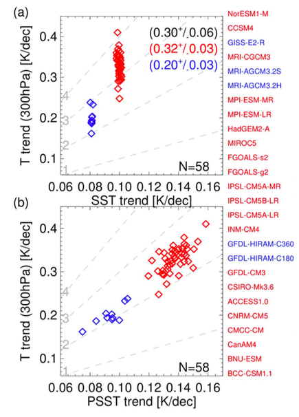 Upper tropospheric warming trends in AMIP (prescribed sea surface temperature) simulations at 300mb over the period 1984-2008 averaged from 20S-20N, in the CMIP5 archive. Red and blue correspond to models that used two different SST data sets. SST on the x-axis in the upper panel is the mean SST over the tropical oceans. PSST in the lower panel is the mean of SST over the tropical oceans weighted by the pattern of precipitation simulated in each model.
Let’s turn once again to the problem of the vertical structure of warming trends in the tropical troposphere. (Warning: this post contains no comparison with data — the point is to try to clarify how to think about the GCM simulations.) In two recent posts, #54 and #55, I discussed a paper, Flannaghan et al 2014, in which my colleagues and I focused on the simulations in the CMIP archives in which sea surface temperatures (SSTs) are prescribed following observations (“AMIP” simulations). There is interesting spread in the upper tropospheric warming trends even in these AMIP simulations, as indicated in the figure above, taken from a new paper Fueglistaler et al 2015. Each dot corresponds to an AMIP run from a different model. In the upper panel, the 300mb temperature trends are plotted against the trends in the prescribed tropical SSTs.
It turns out that not all of these models use the same estimate of the observed SSTs. The two different data sets used have modestly different trends in the tropical mean SSTs, and those simulations that use the data set with the larger trend produce larger upper level trends as well, not surprisingly. But it was surprising to us how big the difference was, given the amplification expected from the usual moist adiabat argument. As described in post #55, we can evidently explain this difference by looking at the SSTs weighted by the precipitation when taking the tropical average (We call this quantity PSST here.) The upper and lower troposphere in the tropics are strongly coupled only in the regions of deep convection. In the simplest picture, the rest of the tropics adjusts its temperatures to the moist adabat set by these convecting regions. We use precipitation as a marker for these regions. The difference between PSST in these two sets of simulations is bigger and more consistent with the difference in upper level trends.
In the new paper we look further at the differences across the simulations that use the same SSTs. As seen in the figure, using PSST also helps explain the spread in upper level warming among these simulations. The result is a pretty consistent ratio, about 2.5, between the 300mb temperature trend (this is roughly the level where this trend is largest in the models) and the surface trends in PSST across all of the simulations.
This means that the spread across the simulations with identical SSTs is explained in large part by the differences in the simulated precipitation patterns, resulting in different trends in PSST. This spread is partly due to differences between models and partly just due to differences in the precipitation in different realizations of the same model resulting from internal atmospheric variability. Both of these sources of spread seem to contribute.
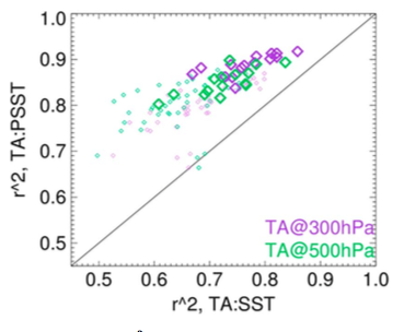
If we remove the linear trends from each simulation and then correlate the month-to-month variations in the upper level tropical mean temperatures with the surface, we find consistently larger correlations with the mean tropical PSST than with the unweighted SST itself (see below for a plot of the explained variance using PSST vs the explained variance using the tropical mean SST– the big symbols correspond to ensemble means for individual models; the little symbols to single realizations; purple refers to 300mb and green to 500mb temperatures — the figure is from Fueglistaler et al 2015. once again). This corroborates the idea that PSST is a good indicator of the information passed from the lower to upper troposphere. I was a bit surprised by this result, given an earlier paper that I was involved in that suggested that SST and PSST were interchangeable when thinking about the warming response to El Nino.
If we understand what underlies the spread across models it should be easier to to study differences between models and observations. This work suggests that observational estimates of PSST are valuable in this context.
PSST is defined using ocean temperatures only. It is important to exclude surface land temperatures when relating upper level and surface temperature trends. PSST is a surrogate for the entropy of near-surface air in the convecting regions. This entropy depends on humidity as well as temperature, but over the oceans it seems that we can avoid thinking about this because relative humidity does not change much. But over land this is not the case. It would make sense to include land in this kind of analysis if you know the entropy of the convecting regions, but you can’t replace the entropy with the temperature. Confronting model results with observations would then require knowledge of humidity trends over land.
Since there is quite a bit of convection over tropical land, it is surprising to me that using only ocean temperatures works as well as it does in these two figures. Perhaps this is related to the idea that entropy changes over convecting land regions are constrained to be comparable to entropy changes over the convecting oceans. (See post #56.)
[The views expressed on this blog are in no sense official positions of the Geophysical Fluid Dynamics Laboratory, the National Oceanic and Atmospheric Administration, or the Department of Commerce.]
Isaac, thanx for the posts – I appreciate this blog.
The warning about no data comparisons is duly noted, but to the point about tropical upper tropospheric temperature trends reflecting tropical sea surface trends, observations do appear to bear this out as well. Since 1979, there doesn’t appear to be much of a ‘hot spot’ in upper air observations, but that doesn’t mean the tropical convective coupling is violated. Indeed it is somewhat borne out, because for that period, much of the tropical Pacific has incurred a cooling trend which has moderated the overall trend in tropical SSTs.
The lack of a ‘hot spot’, then, would seem not to be a shortcoming in GCM convective transfer, but rather a variance ( natural or otherwise ) in the tropical ( and larger ) SST trends in the Pacific.
Yes, that’s the whole point of analyzing these AMIP simulations, to try to test the convective physics of the atmospheric models in isolation from the SSTs simulated in coupled models. All of the simulations discussed here use estimates of the observed SSTs over the satellite period. What interested us was that even with this constraint there was substantial spread in the upper level warming in the various models.
Hi Isaac,
I found something relevant to this blog post that seems interesting and wanted to run it by you in case you had any thoughts. Having heard many times about how tropical tropospheric amplification appears to be occurring as expected in high-frequency variations yet not quite as expected (albeit uncertainties) in the multi-decadal trend, I thought it would be interesting to investigate the spatial structure of the high-frequency amplification.
My initial focus was the nino3.4 region since ENSO seems to dominate high-frequency variability in the tropospheric records. First looking at the standard region (5S-5N, 195E-240E) I was somewhat surprised to find that tropospheric TLT variations occur with a noticeably lower amplitude than at the surface (note: all plots use 12-month running mean). Recalling an article I’d read about how the troposphere warms following El Nino events with rising and spreading I considered that perhaps a tropical Nino3.4 region (defined as 20S-20N, 195E-240E) would demonstrate the high-frequency amplification I was expecting. It turned out that there was very little difference, except in a few discrete sections on the time series. Seeing this apparent structure I made a difference plot between tropical Nino3.4 and Nino3.4 in three TLT products. The basic structure is the same across all (though it is interesting that the older UAH and RSS versions are very close but the latest UAH version shows some discrepancies).
This was intriguing for two reasons: 1) the apparent extreme non-linear tropical spreading during the “Super El Nino” events, and 2) I thought I recognised the shape of the time series, and realised where I’d seen something like that was in the Nino1+2 index.
Immediately I was curious about whether models produce this behaviour, so first looked at a TLT construction using the GFDL-Hiram-C180 model AMIP simulations you’ve previously posted about, and found that the model behaviour was nothing like the observations suggest should be happening. During the “Super El Nino” events the model was producing greater anomalous warmth closer to the equator, rather than the tropical spread indicated by observations. Other AMIP models I tested showed similar results.
The main things I’m wondering are (beyond “Have I screwed up somewhere?”) whether this is a known phenomenon, relating to something it’s known that the models aren’t getting quite right? Could the correlation with Nino1+2 point towards a cause or source for the phenomenon? And could this partially explain, or rather pin-down, discrepancies between models and observations in multi-decadal trends?
Thanks.